A simply way to improve visibility for customers into projects is through reporting and metrics.
Report the team's productivity after each iteration. Also show the target for the team. I report function points per hour because I want to see the productivity going up.


Burndown & Burnup
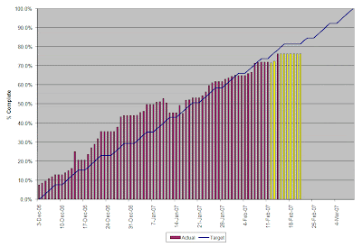
Use a burndown chart to track the remaining effort against plan. Use a burnup to track the % complete against plan. I color code the bars to indicate where we went off track. I also add call outs to explain large changes. I report the data in a small table (e.g., planned effort, actual effort remaining, difference).
Testing
There are several reports that you can create to provide visibility into testing. This example represents our defect trend by severity over the course of an iteration.

Attrition Rate
Most of our clients are concerned about turnover and losing key resources. We have introduced the following graphs to track our attrition rate per quarter. We also list the resources that left and the reasons for leaving.


Other Metrics Under Consideration
- Planned vs. actual features delivered by iteration
- Velocity (# of FPs delivered by iteration)
- Defect discovery rate
- Defect density (defects per FP)


8 comments:
I really liked the metrics you have collected. I would like to know more about these.... do you have a working sheet for all these calculations along with the metrics you ahve mentioned like defect discovery etc
deepa, send me your email address and i will send you the template.
People should read this.
Thanks! I might change it a bit in the future given some books I have reach about designing dashboards.
Hi Andy,
Can you send me the worksheets on my email id s_ruchit at yahoo.com ? I really look forward to explore it in much depth.
Hi Andy,
I too would appreciate a copy of your spreads. Very impressive. richard.twhite@yahoo.com.
Thanks.
Rick
Your charts look good, but most people will be using Excel, so why complicate it for them? If there is a template built, then all they need to do is plug in the numbers and they're done.
Andy, good article and keep posting. It will give light to us and who ever following scrum. Please send the excel templete to jumbomahadeva@gmail.com
Thx in advance
JM Deva
Post a Comment